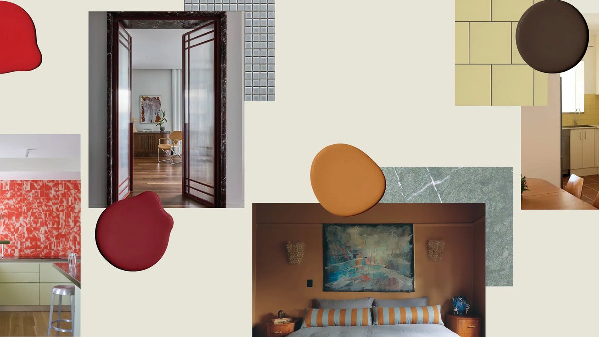
When it comes to designing a home, colour plays a significant role in influencing the room’s energy. With numerous options available, selecting the right colour combinations can be challenging. To help, here are seven trending colour combinations, along with favourite paint colours from Melbourne brand Tint.
Dusty blue and gold is a popular combination, created by using two contrasting colours from opposite ends of the colour wheel. This pairing works well in bedrooms or living spaces, with Tint’s Rocky Racoon paint colour creating a warm and cosy backdrop.
Trending Colour Combinations
Butter yellow has been trending for the last few years, and when paired with grounding browns, it creates a fun and sophisticated look. Tint Always Sunny is a soft shade that works beautifully with earthy timber flooring and deep joinery.
This combination is reminiscent of a classic chocolate banana sundae, evoking the nostalgic styling of the 1970s, making it equal parts fun and sophisticated. The earthy tones also allow for the incorporation of espresso-inspired velvet fabrics, adding depth to the space.
Red and green can be a tricky combination, but when done correctly, it can turn heads. A punchy, strawberry-style red alongside a pastel, cool-toned mint like Tint Inner Self creates a unique and refreshing look.
Read Also: Australian designer renovates unfinished Melbourne home
Mauve and camel is a more muted combination, perfect for those starting to experiment with colour. Tint Hygge or Tint Baker’s Dozen are suitable for almost every room, and can be styled with dark metal accents and boucle fabrics for added texture.
Calming and Balanced Duos
Blue is known for its calming effect, while burgundy hues signify power and luxury. When paired together, they create a dynamic and balanced duo. A subtle blue like Tint Bubble Bath is an excellent hero colour for layering in elegant burgundy accessories.
Pink is no longer just for a little girl’s room, and when paired with earthier tones like terracotta and timbers, it creates a more refined look. Tint Wednesdays is a classic rose shade that works well in kitchen renovations, as seen in WOWOWA’s Claremont project.
Pistachio and brown is an effortlessly tranquil colour combination drawn directly from nature. A pale green like Tint Hey Pesto lends itself well to oak, chestnut, or walnut furnishings, and can be completed with beige sandstone tiles and soft creams for visual variation.
